KCOS Art Auction again this year!

I’ve donated “Stumbled Upon” to the KCOS Art Auction this year.  It will go on auction Friday April 27th in the 5:30-6 slot.  Get full information here: https://www.kcosartauction.org/april27

This is my fourth year donating to this great cause, I love public television, and I hope that you’ll check out the auctions and take home some lovely artwork. 

These are the last three paintings I’ve donated to the KCOS Art Auction! The big sunflower (Flor del Sol) won the Juror Award in 2018.

Rocky mountain plein air

In October our group went out to paint in the Franklin Mountains State Park which is a beautiful place to hike, camp and commune with the desert landscape. Here are steps in my process of expressing what I saw and felt that day.

img_20161021_102945728-768x1365.jpg

Initial inspiration and shadows closeup

Broader initial view on that beautiful October morning

First wash of warm and cool shades

First wash dry and set up on the easel and even in the short time I needed to wait for it to dry, the shadows and consequently the lights changed.

Pretty close to stopping for the day, I liked putting the painting against the natural elements i am trying to portray.

Here it is on the easel. Look at the small shadow now because time had gone by, it was 11:30ish.

I try to paint in the shade, both for my comfort and for not having a glare on the paper.  I was painting in the picnic shelter of a campsite in this wild state park that is the only such Texas park with an urban area city limits. And only five miles from my house. I have to get out and paint here more!

More accurate view of color depth taken indoors during the days I spent thinking about what to do next the piece

img_20161207_155553.jpg

Glossy areas are masking fluid shapes.

I added more details. The shiny gray areas are shapes covered with masking fluid to have lighter shrubs after darks are painted on top.

Then I got carried away and made the darks a big block of the bottom without a pathway through the painting.  I also didn’t like the curved yellowy sotol shapes in that area.

I thought the lit area and the rocks on the right had some merit, so I lifted up part of the foreground left area and made rock like shapes there.  And that is where it is right now.  I think I may crop it and frame, but not sure now. Any suggestions?

I will probably paint this again in the studio, and definitely go out exploring in this wild place to find more sites to paint. Stay tuned!

Don’t forget that you can purchase prints cards and ornaments of my work at my online store: https://squareup.com/store/rcmurphree_watercolors

Abstract rocks — Tina Stallard workshop

img_20161109_112622-731x1080_wm-1

This week I took a fun and really informative workshop with Tina Stallard, a fabulous watercolor painter from Albuquerque.  The class was structured to teach us design elements to make stronger work to submit to juried shows.  It was intensive and I learned so much.

She brought two black and white photos for us to choose from to use as a basis for creating a value sketch that really works, including strong design scenarios such as the cruciform shape of darks/lights in a intersection shape around the focal area, a radial arrangement that radiates out from the focal area, and another common one, a horizontal/vertical arrangement.  She strongly recommend buying this book Seven Keys to Great Paintings. If you are unsure what I am referring to, browse some of her pages.  I can’t wait to get my book in the mail.

This is an abstract based on a black and white photo she took of the rock pattern in a dry river bed, and some of us really made it abstract with wild fun colors.  I chose more earth tones but added pops of dark color near the focal point which made me uncomfortable initially, but now I see the value of it.  I think I will eventually crop this smaller but I’m happy with all I learned.  I’m hoping to have the time in the next couple of days to work on value studies for future paintings to really “bake in” what I learned.

img_20161109_114343_wm

As a wind down activity on the last day we did a wet in wet wash with colors and let it dry during lunch.  Then we came in and sketched a design lightly on the top and used negative painting, or putting darks in to define shapes, to create a painting.  I like how this one turned out!

And now the rest of the workweek will be focused on getting ready for my booth at the Queen of  Peace bazaar.    I can’t wait to see how that all plays out!

Thanks for visiting and thanks in advance for your comments.   I enjoy hearing from you!


4–>40 Easel Features

The lidded palette all covered up. Usable as a shelf.

The lidded palette all covered up. Usable as a shelf.

If you remember on the first day I took the easel for a test drive, I was using a handheld palette and not the shelf palette that came with it.  I hadn’t had time to fill it and didn’t want a gooey wet mess taking it places.  Ask me how I knew that might happen!  ha!!

Over the past weekend, I decided what colors to include and what colors to put in auxiliary smaller handheld palettes to supplement the 14 wells in this one.

Cover removed and slid under as a mini shelf in front

Cover removed and slid under as a mini shelf in front

Here it is with its cover, so you can use it as a shelf.  in the next photo, you see the colors I’ve chosen and the cover turned upside down and slid under it to make a mini shelf in front.  I have taped on it the colors I’ve used and a small box that business cards came in into which I’ve put tissues.

My colors right now in this are (counterclockwise from left): viridian, winsor green (yellow shade), cerulean chromium (Daniel Smith), ultramarine blue, cobalt, quinacridone burnt scarlet, quinacridone burnt orange.  then there’s the very convenient hole for a water cup. Carmine, Winsor  Red, permanent rose, cadmium orange, quinacridone gold, new gamboge, and aurolein yellow. Notice the nice deep wells and plenty of mixing area.

This lid and palette are great because if you choose not to buy the tripod that comes with the set from En Plein Air Pro, the wing nuts allow you to slide it onto any other type tripod. I chose to buy the tripod because they recommended it as sturdy enough to hook on an umbrella, and buying the entire package was a reduced price.

2015-11-10 10.37.15

easel in action with shelf under large palette holding tissue box and paper towels covered inside a cloth type tyowel, and my sketchbook with value sketch laying on top.

So here’s the set up with a painting on the easel.  you can see there’s a pull out holder for brushes on the left, and a place to hang the included collapsible water bottle.

2015-11-10 10.37.03

Palette flooded with water

Sad to say, I had a bit of an incident with hitting that receptacle with my brush handle and knocking water onto my palette, specifically onto the oranges and yellows.  Grrr. I have been known to be sometimes a tad clumsy but I bet I’m not alone in this.

My husband dug out an S hook and today I hung the collapsible water bottle from the mini shelf at the front right and it worked SO much better!  More on that later.

plein air in my garden

plein air in my garden

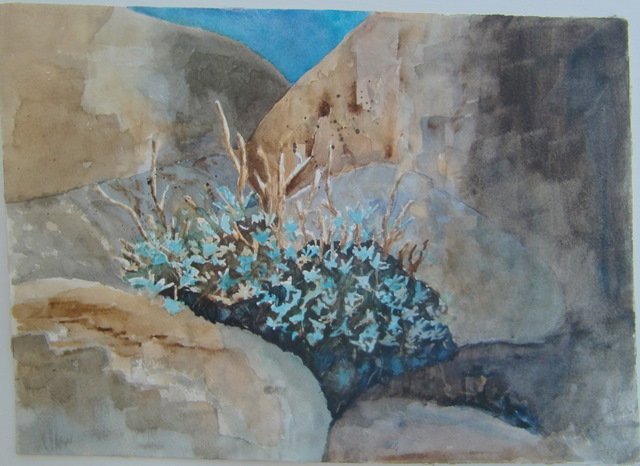
Oops, almost forgot, here’s a cropped view of that painting from the easel, still working on foliage and flower blooms.

Thanks for stopping by.  I enjoy hearing from you!  Bye for now…

p.

Day 27 — Desert’s Green Glow (plein air)

Plein air painting of mountain with green patches

Desert’s Green Glow. Click image to view larger. 8″ x 10″ watercolor. $25

The El Paso area is bisected by a mountain range.  The mountains are a beautiful rocky presence in the life of the city.  For most of the year, they are subtle shades of ocher, sand,  gray, blue, purple, and browns, tinged into a watermelon color for the several moments of the gloaming before sunset.  We get 7″ of annual rainfall, and most of it falls in late summer/early fall.  It’s called our “monsoon” season which is a laughable name in some respects! It is during this period that we see the subtle green glow of grasses on the mountain. It’s an exciting time for me and lets me feel like a true El Pasoan (even though I’ve lived here less than 20 years) because I know that freeway travelers passing through will not even notice this green glow.

day_27_plein_air_setup

My painting set up under a shade overhang of a picnic table in the state park area of the mountains. The mountains across the road are what I focused on. Click image to view larger


I traveled over the mountain today through the pass created when the road was built, and set my plein air paint set up on a covered picnic table in the state park area.  You can see it here.  The weather was cool, even with the sun’s heat, and I spent an enjoyable couple of hours painting and experiencing nature on a quiet Sunday morning.

Help me name this painting…

Watercolor of rocks and flowers by Rachel Murphree

11″ x 15″ watercolor of mexican poppies, prickly pear and rocks. Click on image to view larger.

So, as promised, here’s the finished painting from the photo I shared in the last post. I took artistic liberty with some of the rocks to make it a better composition.

This was definitely a painting that was giving me fits as it progressed.  It had its long moments of “adolesence” when all seemed to be a bit off, but it came together in the end.  When I paint this again, I will know better how to do it from the start, and not have to lift out so much color and repaint.  That makes it seem overworked to me, and not the spontaneous look I’d prefer.

But I think the discipline of continuing on when it got difficult, realizing problems and fixing them, is worthwhile, both in painting and in real life — don’t you think?

As of now, the working title is Poppies’ Rocks but I’m thinking there has to be a better title. What do you think? I’d love to hear your suggestions for a name for it.

Thanks for stopping by and letting me know your thoughts…

Happy mail day today!

black velvet brushes to try out

Synthetic squirrel blend brushes

Today was a fun mail day. A package came from Dick Blick with new brushes that had come with good recommendations from several people, including folks on the Watercolor Workshop facebook group.   I am in LOVE with these black velvet brushes! Wow. They are a mix of squirrel and synthetic, hold a lot of paint and have a wonderful point. Perfect for the brushwork I want to practice and perfect to make blossoms of all shapes.

A local artist had suggested that I should buy sable hair brushes, but I’m just not ready to commit that much money to a brush. The black velvet seems like a reasonable alternative that is a step up from the other synthetics I already have.

So there’s a 1″ oval (the thick one in the middle) and a #10 round on top.  The striper at the bottom is lovely to make thin lines that become thicker and then thin again, depending on the pressure you place. There’s also a thin script brush.  The white brush is called a comb and it makes the thin edges of grass quite nicely. I am doing a happy dance having such fun playing with my new tools.

watercolor of red bird of paradise bloom by Rachel Murphree

Red Bird of Paradise watercolor from 2013

The package also had some new colors, that I’m in the process of combining with other colors and making color charts.  One of which is Pyrrol Scarlet which is the lovely strong red that’s in the middle of the practice page behind the brushes. I can see this working wonderfully with Pyrrol Orange to make the Red Bird of Paradise blossoms that fascinate me.  I did this painting several years ago and feel that I understand both watercolor and the blossom so much better now. This is definitely a subject on my to do list to paint again this summer.  The next painting will be much more clear and light and more like the watercolor I am aiming for!  I will probably paint this more than once!!  Painting in a series is so helpful because it deepens my understanding of the subject and the colors chosen.

We all grow up thinking that red and blue make purple, and they do, but it’s fascinating to see what kind of purples this red makes or *doesn’t* make with the seven or eight blues I have.  they are more of a grayed purple for sure.  More on that later…

Photograph by Rachel Murphree

Photograph of poppies in the rocks

And lastly, here’s a photograph from which I am working and will hopefully post the finished painting this weekend.  so I’ll leave you with this for now….

Thanks for stopping by.  I enjoy hearing from you.  If you’ve had experience with these brushes, or would like to share how you use pyroll scarlet, please leave me a comment!

.

Stop and rest

Watercolor painting

Stop and Rest. Forest scene with rock. Click image to view larger. Available.


Here’s the second piece from Wednesday’s class on creating textures and fixing problem areas.  The instructions were a rock with grasses in front and lots of green behind, letting rich colors run in the background.

I posted a picture below of what it looked like when I came home.  The rock was floating, flat bottomed like some weird space hovering.  I didn’t like the grasses.  I can’t wrap my head around yet how to negatively paint the tops of grasses to get them to be thin blades, and I liked some colors in the mixing but the blues were too prominent and separated in the forest.

painting at early stages

How it looked after the class. it needed some help!

So I did some scrubbing out of edges with a coarse hair cheaper acrylic brush that I cut down to make a stiff ridge, painted down over the tops of the grasses and then pulled up with a palette knife to get the grasses I wanted.  added more color in the background, tried to create masses of bushes/trees with spattering of water, etc.  

While I wish that I had gotten this look earlier on so that it looked fresher and less worked, I’m glad I rescued it.  I’d love to hear your thoughts!   Thanks for visiting. 

Painting sunflowers

I’ve been re-evaluating my life recently and decided to make more time for painting and not always have too much on my plate.  It’s been a very good thing for me and for my family!  So here are two pieces I’ve worked on recently.  The flowers are from an exercise in a book called Watercolor Painting: Layer by Layer, and while I’ve learned, I think I want to take the principles embodied in the lesson and paint my own set up or vision, because I”ll be more engaged in the piece.  but I’m reasonably happy with how the flowers came out .  Sunflowers

And here’s the other one, this was not from a book but after researching how to make realistic rocks.

In Between The Rocks finished

From WC2010-2011

I’m calling this one finished. There are subtle changes, some more modeling on rocks, stems and shadowed flowers in the plant mass and change in sky color. What do you think?