Work in progress: fantasy beach

As a beach comber this might be a fantasy beach…it is a piece in progress started by laying in colors in a soft wash and then carving out and defining shell shapes with medium and dark values. It is a lot of fun and maybe 75% done.

The next steps are to make some shells more believable and continue getting depth and partial shells. Also I will string a path of darks leading you into the left top shell focal point.

This is the painting in an earlier stage. What do you think? I would love to hear!

Negative painting in process

negative oleander demo 5In thinking about what to do for a lesson for today, I started explaining negative painting in a small demo and in a larger painting.

Negative painting is when you paint the space around an object to make the object appear.  An example would be if you wanted to show a house with trees behind it, you show the shape of a house by painting the tall trees normally shaped at the top, but the sides and bottom would end at the straight lines of the roof and house.

Another way to do it is to paint pale layers, draw a design of a leaf, for example, and that leaf is the closest one to you as it’s the lightest.  The next leaves that can go under the first, are darker because of the paint you’ve put on to form the first leaf. There are lots of videos and pages on this technique that is sometimes hard to get your head around, but I thought it might be fun for her to try.

So to explain how it works, here are pictures in order of what I’ve done so far on the demo:

negative oleander demo 1

After a quick drawing of a simple clump of white oleanders.


negative oleander demo 2

a pale wash of thalo blue and hansa yellow surrounding the clump of oleander blossoms.  I let it dry thoroughly,


negative oleander demo 4

I’ve added more washes of similar colors carefully going around some leaf shapes.

negative oleander demo 3

I’ve gone in with light purples (made with quinacridone rose and thalo blue) to separate the blossoms as a start

negative oleander demo 5

So here’s where it stands in the latest photo with additional washes on top, sometimes with quin rose in them, to define more leaves and put some behind the lighter ones on front.  The key to this is to let each layer dry completely before doing another, and to smooth out the edges of the latest wash so that it only makes a hard line to define the shape.  I do see a hard line I need to soften, and it needs more leaves and stems and darks and detail work on the flowers. Tomorrow I’ll post the larger oleander painting in process that I’m working on.

What I’m enjoying about teaching is that it gets me excited about a new project!  there are so many good things about teaching that I’m discovering as I go along, not least of which is enjoying her process and successes, and showing the process of figuring out what went wrong and what to do differently the next time.  Exciting!


Post #3 on Lantana WIP

in progress watercolor

Lantana in progress with negative painting of stems and leaves

I put soft graphite with the edge of a 4B pencil on the back of the tracing paper but then realized I couldn’t see the sketching I’d done on the front! so I softened the back graphite with a tissue to not have scratch marks that would interfere with the drawn stem outlines, and I was able to quasi see what I wanted to transfer. I used a mix of sketching directly on the wc paper and doing the tracing transfer technique. then I mixed up

in progress watercolor

Lantana in progress with separating some of the clusters with background colors

and blues using cobalt and ultramarine with new gamboge and aureolin yellow. I put some water in areas and painted up to those letting the color blend into the water. You can see that to the right of the largest cluster there’s a water blossom run that I’m happy I didn’t try to fix while wet….I’m finally realizing that doesn’t work! as it is, it looks like it can suggest leaf edges for the background.

In the next image on the right you can see I’m painting over the light rose tones to separate the clusters from each other and put in the first background leaf. I’m leaving the primary leaves and stems in the light color for awhile and see what I like.

I’m enjoying taking my time with this painting, as opposed to doing smaller pieces daily…they both have their merit, but I’m going to enjoy the change. I do intend on sketching daily and posting. I had a drawing breakthrough in our painting group today, can’t wait to share that with you tomorrow!

Tuesday Tips #4 Try and try again!

Watercolor painting of autumn leaves

October leaves with redone background. Watercolor 11″ x 14″ Available. Click on image to view larger.

My tip today is to not be afraid to rework your painting.  After all, it’s only paper!!  If it doesn’t work out as planned, you can lift or scrub or even WASH off the paint under a faucet and work with the colors and shapes remaining.

This is a painting that I did last year and I put a cobalt blue background on it, thinking that the orange in the leaves and the blue background would pop and that it would be a good idea!  well, maybe applied differently it would work, but it didn’t for me.  See the next photo down.  I used the blue too thickly, and it concentrated in places, and I wasn’t able to move it. At the time I was intimidated by backgrounds and I thought…oh well, that doesn’t look good.  and I left it.

previous painting of leaves

Previous version of October leaves with vibrant blue background. Watercolor 11″ x 14″ Click on image to view larger.

This week I pulled it back out and thought, I like the leaves and I have nothing to lose if I scrub off the background.  So I did.  I also took a photo of it in its naked scrubbed self, but somehow I deleted  misplaced that photo so I can’t upload it.  I hate when that happens! It would have been so cool to show you.  Rats.  If I find it, I will upload it.

Anyway, as to the process: I used an older brush, wet it, wet the areas I wanted to lift off color and blotted it off with a tissue.  Sometimes left the water on longer and then blotted it.  “Rinsed, lathered, repeated” until the offending blue was gone.  I was left with a mottled effect of blue staining that I thought might work under browns or greens.

So I put down some lighter tones on top, let them dry, and then came in with darker tones and negatively painted the leaves that appear to be “under” the pile of vibrant ones.

Framed painting

Finished October leaves in square copper finish frame. Watercolor Framed size 18″ square. Available. Click on image to view larger.

So, do I like it now?  Yes, I do because it’s rescued.  If I were to do it again, I would want clearer more transparent tones in the background, but that would be a different painting, not THIS one.  So yes, I like it. Do you?

And I put it quickly into one of my favorite frames, a copper finish square one.  I think it looks pretty good!

3D becomes 2D and the transparent made plain

Drawing of glass, bottle and pottery bird

Drawing exercise, two transparent objects and one opaque

I’ve been taking a drawing and a watercolor class, and attending a painting group that has teachers come in. It’s been a very educational couple of weeks!

Here’s the latest homework exercise: draw two transparent objects. To balance it, I added a third pottery bird.  An odd number of objects is usually better than even.

To make something transparent you accentuate the darks but keep the edges smooth and details vague.  So in drawing, you smooth with the tool called a stump (rolled up paper in a pencil type shape that smooths out the graphite on the paper).

The glass is clear with a dark (blue) base and stem.  The bottle is cobalt blue. The bird happens to be blue with a rusty side.  The faint lines are the folds of cloth under the objects.

pottery and wine glass sketch

In class exercise. Drawing using boxes to define relative size and distance

Here is a class drawing done before the homework: two pottery pieces and a wine bottle.  Really interesting to learn how to make sure the items are in proportion to themselves and each other.

You can probably see the faint box around the pottery with a lid, and the transparent bottle.  We drew the box based on measurements and then filled it with the actual objects’ shapes.

She taught us how to first measure one item (using a pencil and one eye closed and elbow straight), call it a unit, and then figure how it relates to the others.

For example;  the front pottery is one unit and the bottle is 2.5 units high.  I don’t remember the exact ratios.  and then you have to figure out how far in front the one object is from the other.  I had difficulty keeping all the ratios in my head, so in the homework, I actually wrote them down.

So going back to the first drawing:   the bird is one unit high by one unit across, the wine glass is 1/3 of a unit higher on the paper, the bottle is 1/2 unit higher on the paper and tilted.  The glass is 2.5-2.75 units high, the bottle is a hair over 2. It’s gratifying to see the boxes turn into the actual shapes.

The box makes it easier to make items symetrical because you fit them inside the box, marking a center line and balancing each side, best you can.  with practice of course, it will get better…

2015-02-20 08.25.13

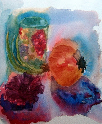
Class exercise: Simple shapes: cones, cylinders, spheres and cubes in watercolor

We started out drawing class with simple shapes,and  I thought…I should probably try to paint these…  sure enough, in the watercolor class day two was painting shapes, in this instance with two colors,my favorites, an orange and a blue.

So my plan is to paint the bird/glass/bottle painting and transfer what I learned from drawing into watercolor…  watch this space.

Day 3 negative paint

20140403-204420.jpg

well folks, day 3 and negativity is hard for me. Painting around the shapes and making them appear magically makes my brain hurt! But i do like the tulip shape far upper left.

Lesson well learned

From WC2010-2011

This piece will fall into the “lessons learned” category. To see the full story, click on my picasaweb album and start at this photo of the setup. and here’s a sketch done after the fact of the shallow pottery piece, one of the things that caused me trouble in this piece that is the first of many in a pile called “Lessons Learned”.

From WC2010-2011

I’m posting the photos to show the progress and explain what I learned, and because as I improve, these pieces for the pile or bin, as my British friend says, will decrease!